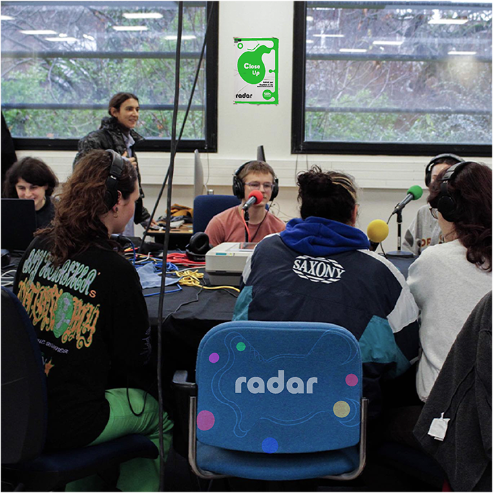
Radar
Ésaat’s student radio association
Radar wants to strengthen its presence within the school by creating a dedicated mobile app.
The goal: to offer students an interactive space to listen, participate, and learn about the school's web radio station.
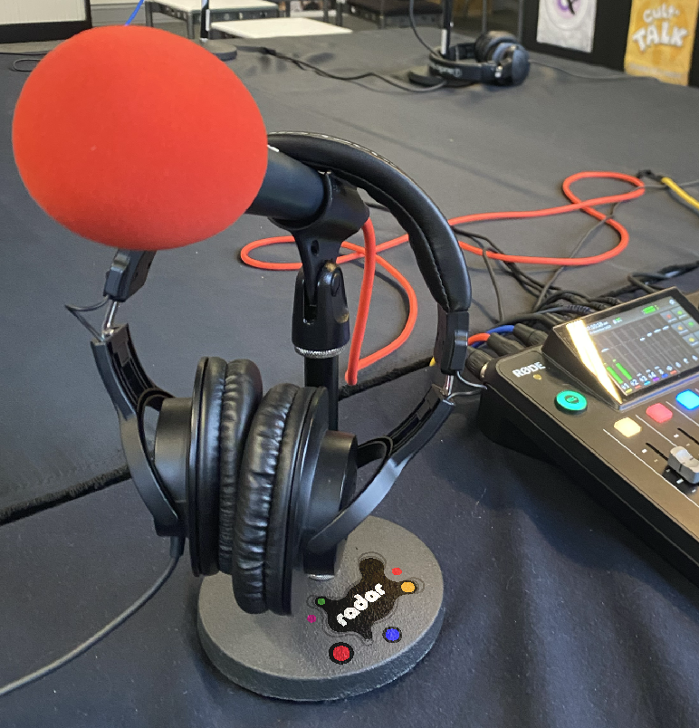
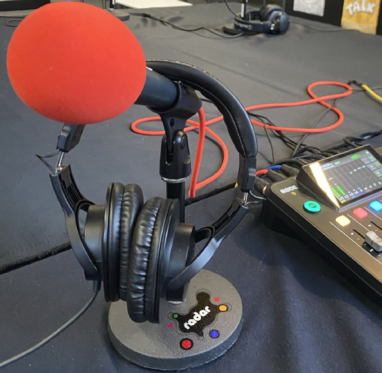
A webradio for the ésaatien.ne.s
As part of my Graphic Design degree, with a focus on digital media, I was responsible for designing the interface of Radar’s mobile application.
The project followed a strategic approach to experience and visual identity design, built around a collaborative media platform in development.
Context
Strategic Vision
Brief
Radar aspires to be more than just a media outlet — a dynamic, evolving platform rooted in student life, where every user can become an active participant.
The goal was to create an intuitive mobile interface that brings Radar to life — expressing its core values of freedom, creativity, and community.
The app lets students listen, contribute, and make the platform their own in a simple, spontaneous way.
Goals
Develop a visual identity that is flexible but distinctive, capturing the essence of the radio.
Design an ergonomic mobile interface for daily usage.
Foster adoption by offering a simple, seamless, and engaging user experience.
Reflect a creative community that is diverse, free, and constantly evolving.
How to translate the free, engaged, and collaborative spirit of Radar into a mobile app that invites users to share their voice.
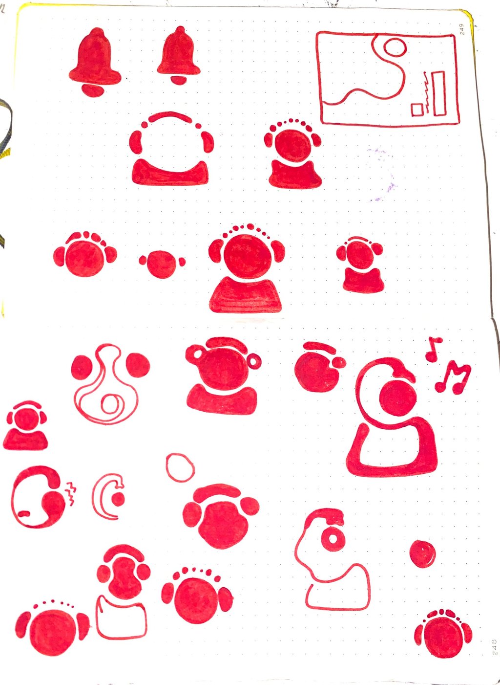
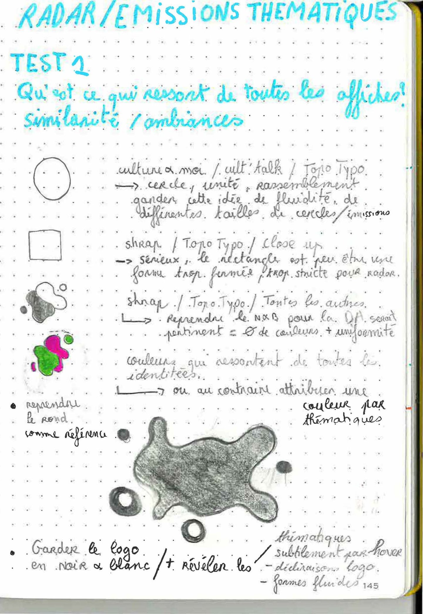
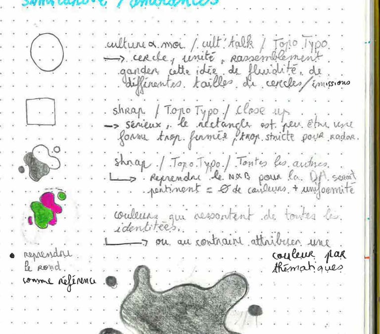
Early design explorations
A lively, flowing form — like a blob — constantly evolving with the community that shapes it.
A blob-inspired aesthetic
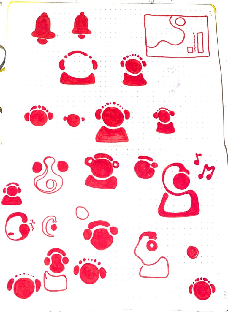
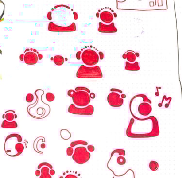
PICTO
These profile icons will be used in cases where students do not wish to import their own image.
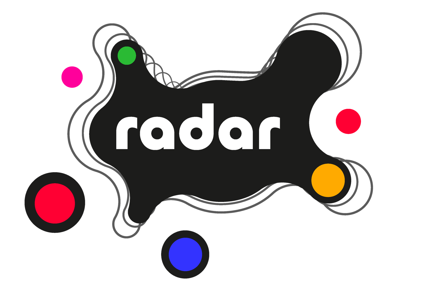
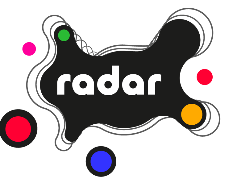
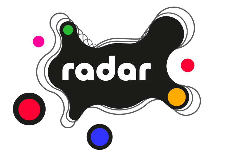
Logo
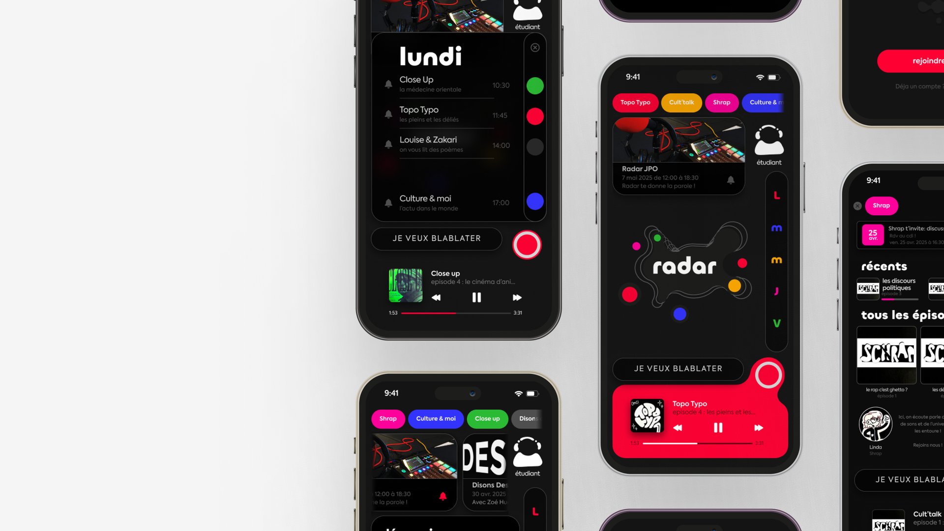
The Radar logotype captures the flow of creative energy through a net-like design that echoes radio waves.
Circles of varying sizes and positions reflect the diversity of contributions — from freedom of expression to active participation within the association. The colors reference the microphones and visually represent the variety of radio shows.
The central focus draws everyone together, encouraging a shared rhythm of creativity and collaboration, where each participant becomes part of the dynamic.
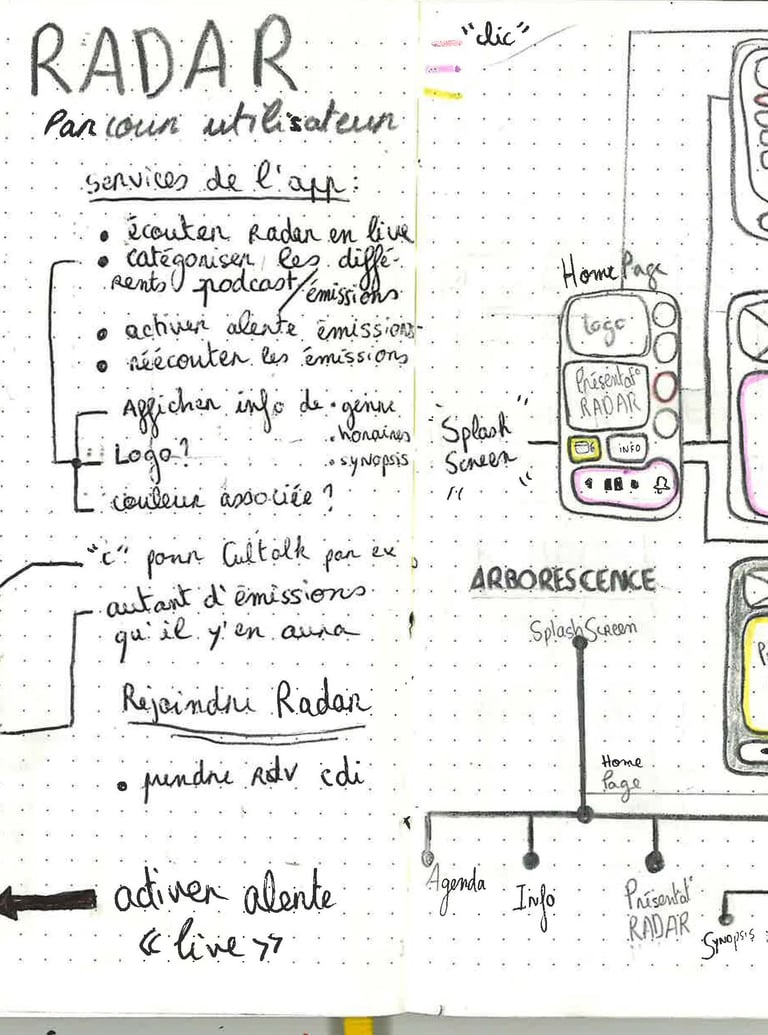
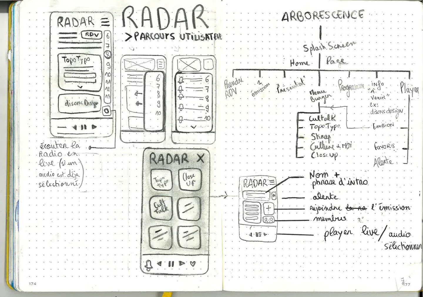
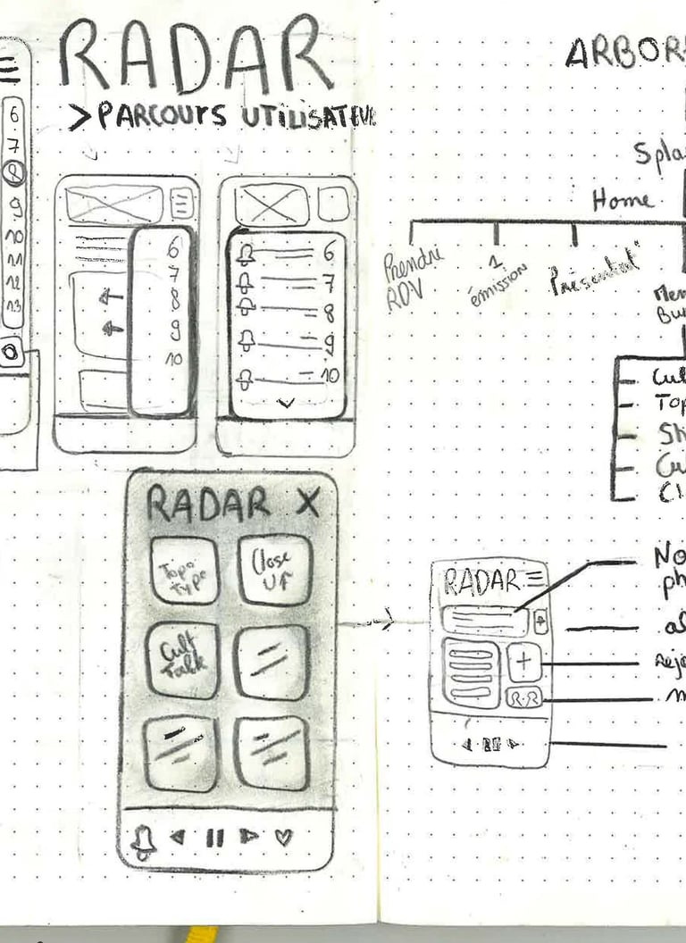
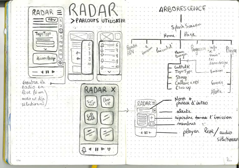
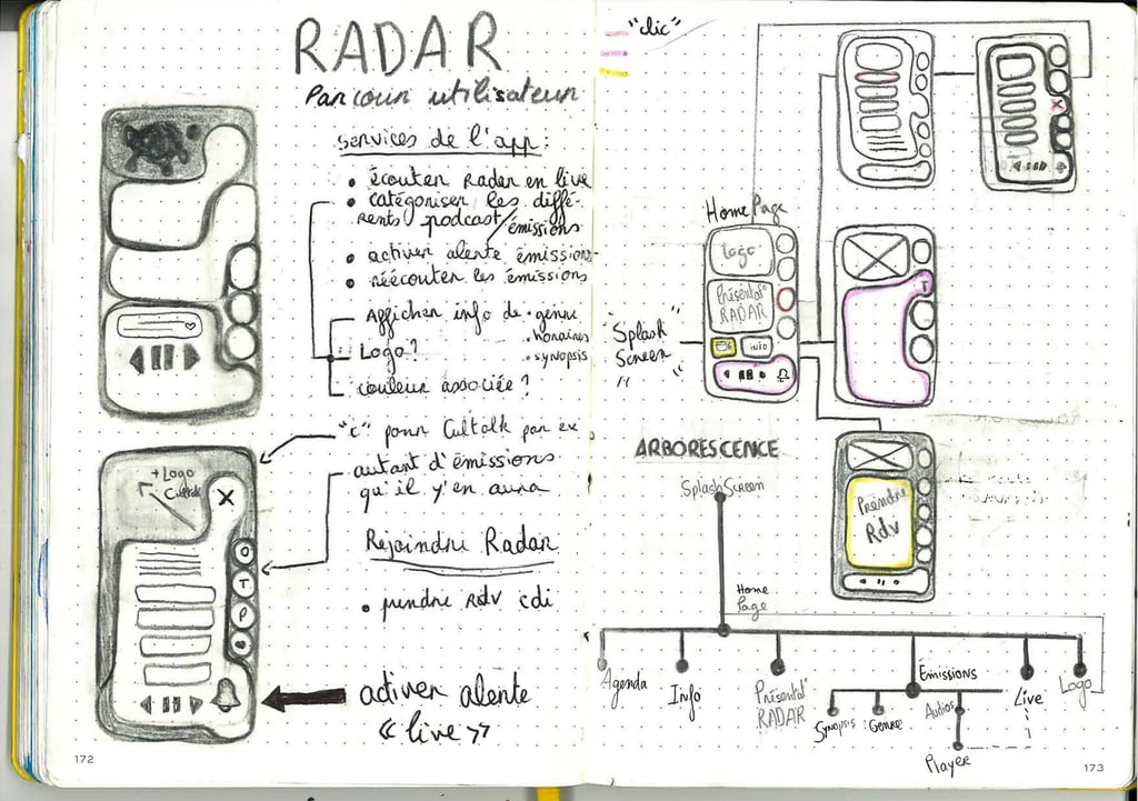
Wireframes
SKETCH — DA RESEARCH — ARBORESCENSE

AXE 1
An attractive organic design, but one that could encounter technical limitations on Figma.
AXE 2
Simplicity and clarity: a functional approach, but less original.
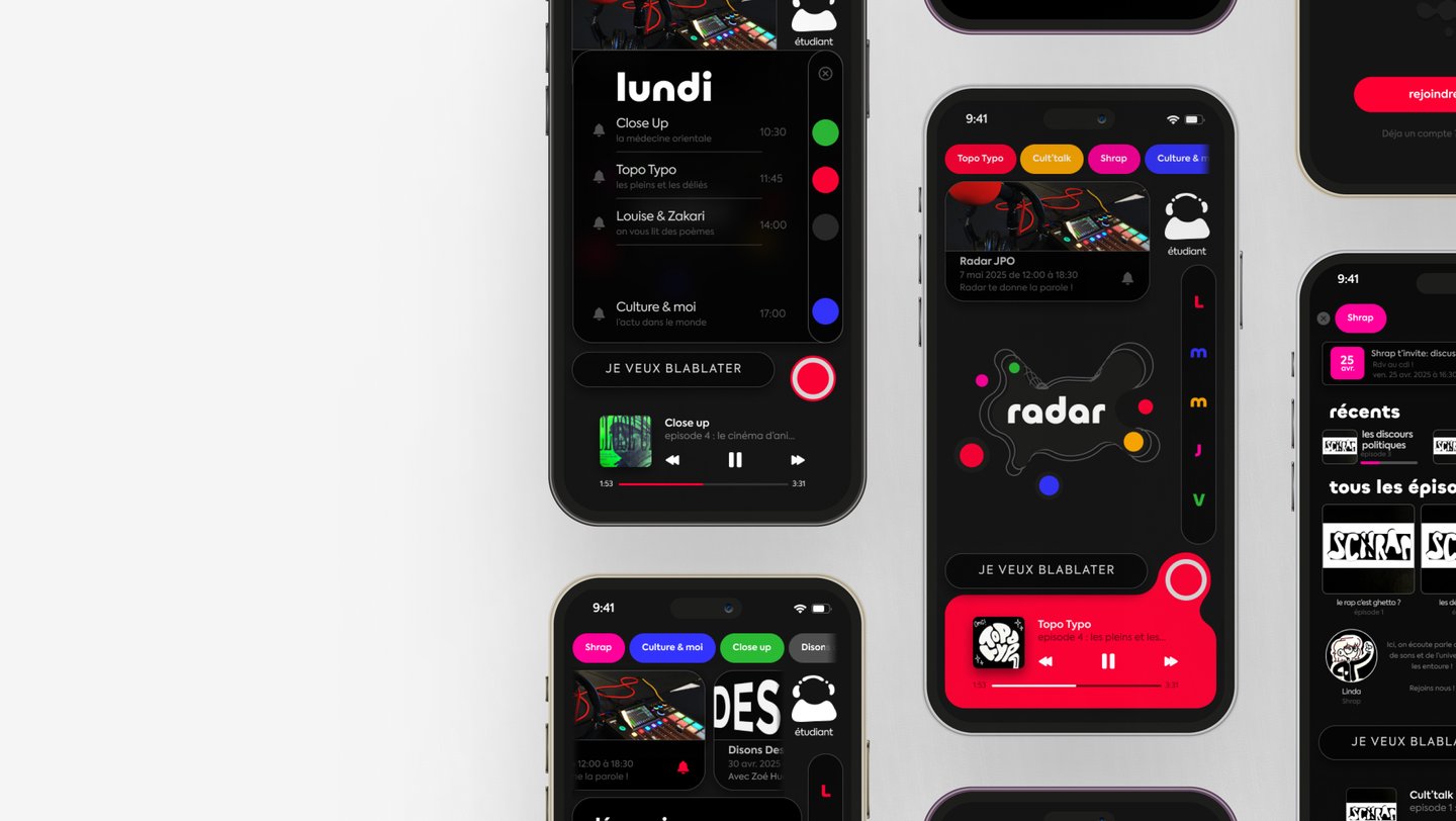
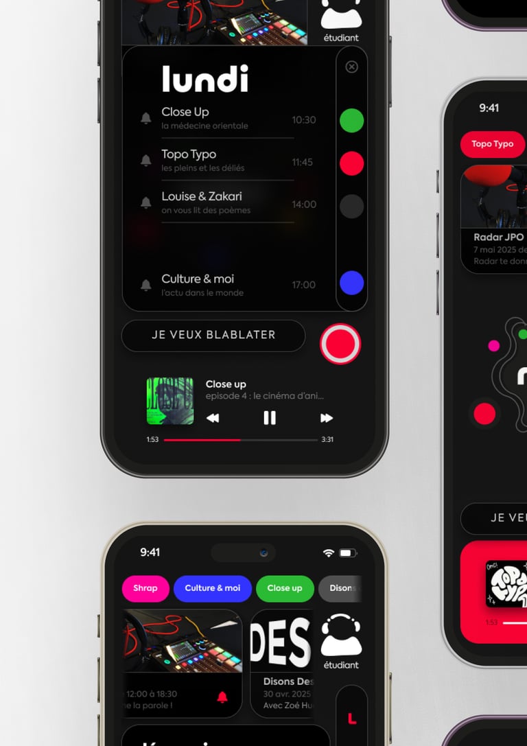
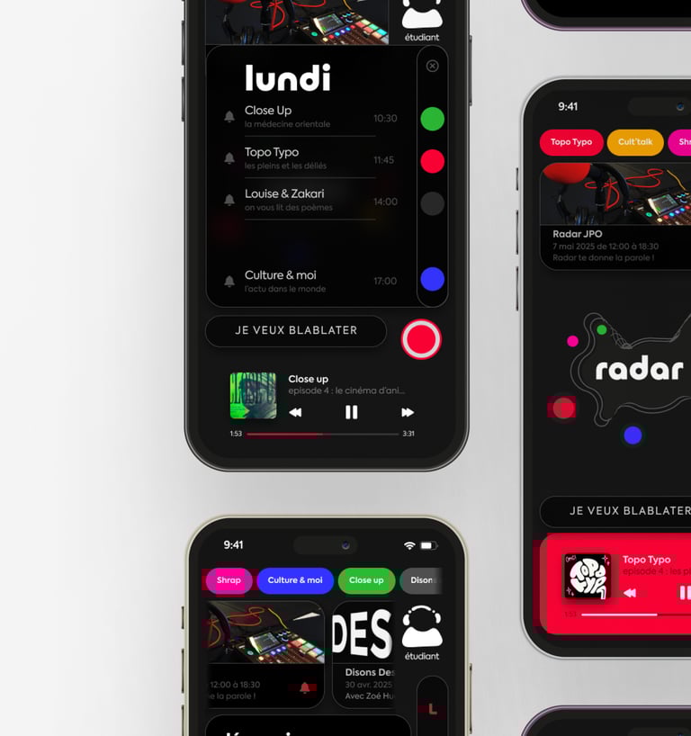
L'app finalisée
Radar Feedback: Try the app for yourself
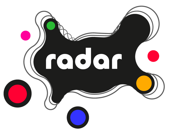
Logo
The logo, rich in detail and visually dense, can be adapted in its typographic version for more understated and adaptable use.


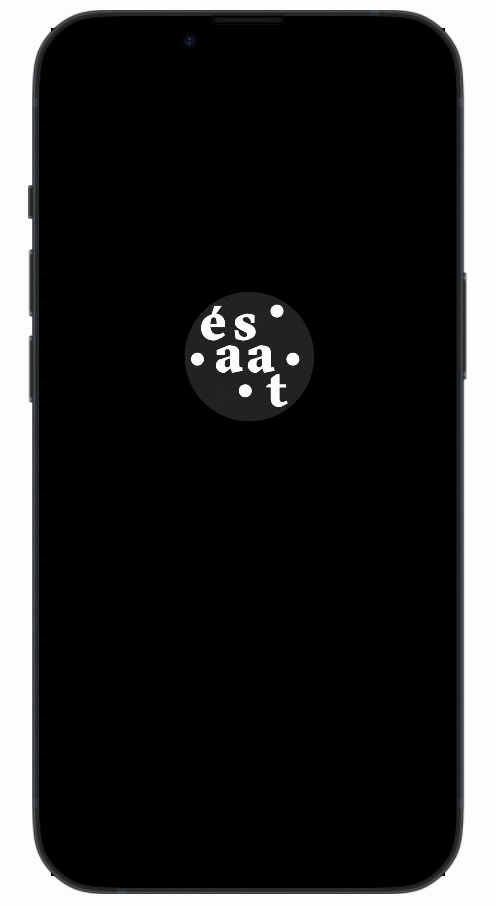
Le splashscreen
A splash screen is a loading animation that appears when an application is launched.
The intention behind this splash screen was to highlight the connection between Ésaat and radio.
L'onboarding
Onboarding is an introductory process that guides users through their first use of the application, introducing them to its features and how it works.
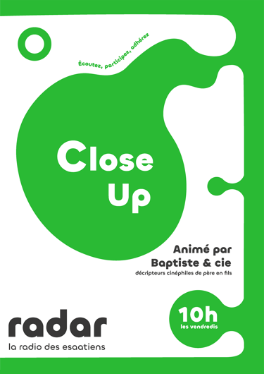
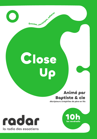
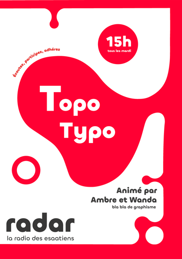
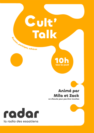
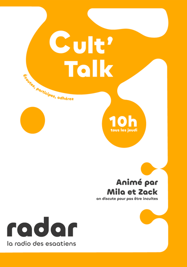
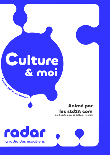
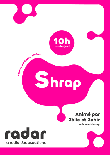
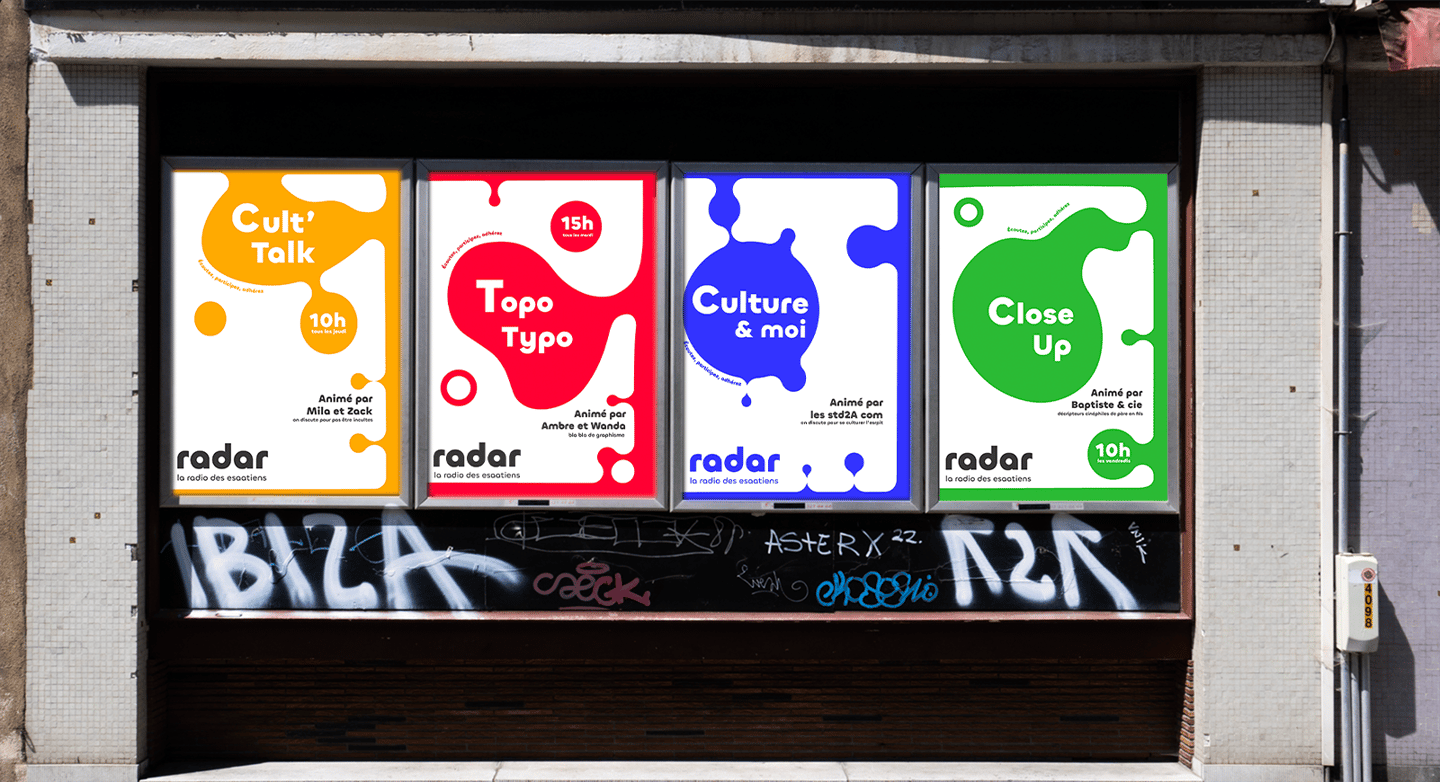
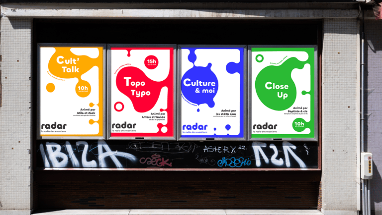
Posters
Each color corresponds to a program; the simple layout, which can be adapted using a template, allows all students to create their own poster, even without graphic design skills.

École Estienne
ESAIG
École supérieure des arts et des industries graphiques
18 Bd Auguste Blanqui, 75013 Paris France
Contacts
dufloteglantine@gmail.com
+33 6 13 96 90 41